
Animation Station
I recently gave a talk in which I wanted to show how the overlap between mother and daughter orangutans’ home ranges changed over time. I’d been itching to play around with the gganimate package (created by Thomas Lin Pedersen; his twitter, his github), and it seemed like the perfect opportunity. If you’re already familiar with ggplot2, then gganimate is a breeze. I was really happy with my final result, and figured it’s probably worth a post.
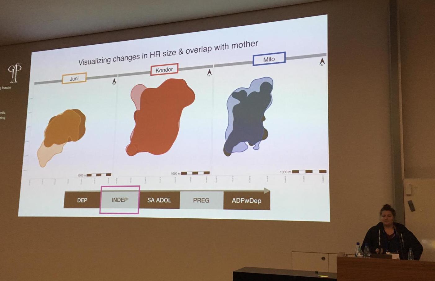
Presenting some orangutan home ranges at the 2019GFP conference - this is an animation in progress!
I’ve also been using the sf package more and more, especially for spatial visualizations, so I’ll use that here too. First, I’ll generate some fake data and calculate the kernel home ranges using sp and adehabitatHR. Next I’ll transform the polygons of the home ranges into sf objects, and plot them using geom_sf() in ggplot2, with some help from the ggspatial add-on. Then, I’ll use gganimate to make the maps come alive.
Start by loading the packages we need…
library(tidyverse) #for ggplot2, forcats, purrr, and a few other useful packages
library(sf) #for working with spatial objects
library(adehabitatHR) #for generating spatial objects (note, this includes the pacakge sp)
library(gganimate) #for animating our ggplots
library(ggspatial) #for adding important map elements (like scales and compasses) to our ggplots
library(viridis) #for pretty colours
Now, I’ll generate some fake data to play around with. I’ll make two different individuals, Pi and Pu, and I’ll make data over 4 years.
set.seed(100)

#make a vector of possible years
years <- c("2015", "2016", "2017", "2018")

#generate some random x and y points, give each indidual slightly different parameters
data <- data.frame(rbind(cbind(X = rnorm(500, 40, 4), Y = rnorm(500, 40, 7),
                               Year = sample(years, 500, replace = TRUE), Ind = "Pi"),
                         cbind(X = rnorm(500, 50, 6), Y = rnorm(500, 50, 3),
                               Year = sample(years, 500, replace = TRUE), Ind =  "Pu")))

# tidy it up a bit and sort by individual then by year
str(data)
#> 'data.frame':    1000 obs. of  4 variables:
#>  $ X   : Factor w/ 1000 levels "26.7168711796743",..: 153 308 265 500 301 355 137 461 100 193 ...
#>  $ Y   : Factor w/ 1000 levels "19.8348510911536",..: 35 292 178 14 277 171 994 356 144 316 ...
#>  $ Year: Factor w/ 4 levels "2015","2016",..: 4 4 4 1 3 3 4 1 4 2 ...
#>  $ Ind : Factor w/ 2 levels "Pi","Pu": 1 1 1 1 1 1 1 1 1 1 ...
data$X <- as.numeric(as.character(data$X)) #make the numbers numeric
data$Y <- as.numeric(as.character(data$Y)) #make the numbers numeric
data <- data[order(data$Ind, data$Year), ] #order the rows by Ind then by Year

summary(data) #look at a summary of the data
#>        X               Y           Year     Ind
#>  Min.   :26.72   Min.   :19.83   2015:255   Pi:500
#>  1st Qu.:39.56   1st Qu.:40.77   2016:260   Pu:500
#>  Median :43.56   Median :47.28   2017:250
#>  Mean   :44.89   Mean   :45.27   2018:235
#>  3rd Qu.:50.06   3rd Qu.:50.78
#>  Max.   :68.99   Max.   :61.65

# add an increasingly large X or Y shift to each individual over 'time'
# (just to make it more interesting)
data$X <- c(data$X[1:500] + seq(from = 0, to = 15, length.out = 500), #give Pi a postitive X shift
            data$X[501:1000] - seq(from = 0, to = 15, length.out = 500)) #give Pu a negative X shift

data$Y <- c(data$Y[1:500], #leave Pi's's Y coords alone
            data$Y[501:1000] + seq(from = 0, to = 15, length.out = 500)) #give Pu a positive Y shift

# now let's break the data in a list, with each individual as one item in the list
data.lsted <- split(data, data$Ind) #split it
data.lsted <- lapply(data.lsted, droplevels) #drop the other individual factor
                                          #levels from each dataframe in the list
Great, so now the data is ready. First step is to turn these plain X and Y numbers into coordinates, and then calculate home ranges…
# turn each individual's dataframe into a SpatialPointsDataFrame with the year as the data
spdf <- lapply(data.lsted, function(x) SpatialPointsDataFrame(coords = x[c("X", "Y")],
                                                                           data = x["Year"]))

# make a grid in which to calculate the UDs
grid.xy <- expand.grid(x = seq(0, 90, by=1), #the min and max X coords +/- a buffer
                       y = seq(0, 90, by=1)) #the min and max Y coords +/- a buffer
grid.sp <- SpatialPoints(grid.xy)
gridded(grid.sp) <- TRUE

# calculate the kernel UD of each individual for each year (this function will automatically
# calculate one UD for each factor level of the data column in the SpatialPointsDataFrame, i.e. in
# this case, one UD for each year)
ud <- lapply(spdf, function(x) kernelUD(x, h = "href", grid = grid.sp, kern = "bivnorm"))

# get the 90% UD polygon for each individual for each year
polys <- lapply(ud, function(x) getverticeshr(x, percent = 90))
So, before I got into ggplot2 and sf, these polygons generated by adehabitatHR’s getverticeshr() function are the ones I would use for all plotting and visualization (just using base R’s plot() function). But I like working with sf objects, and I love plotting with ggplot2, so the following code is - as far as I’ve been able to deduce - the easiest way to get my adehabitatHR output into sf formats.
For those of you who are new to sf, a few brief notes: all sf objects are basically just dataframes - they have all/any data columns that you want (which can be numbers, factors, strings, etc) and can be manipulated just like dataframes, but they also have some extra fun stuff. Most importantly, the extra fun stuff includes a geometry column, which is where the actual coordinates (of the vertices of polygons or lines, or points) are stored. These sf objects also have some general object info, such as the geometry type (there are many possible types, including POLYGON, MULTIPOLYGON, LINE, MULTILINE, POINT, etc), projection info, the bounding box (min and max X and Y) of the data, etc. A full introduction to the sf package and to sf objects is beyond the point of this post (and not really something that I’m qualified to do anyways), so I’ll post some good links at the end of this page!
But, for now, back to these home ranges…
#convert the polygons to sf objects; this will make two objects (data frames), one for each
#list entry (i.e. individual)
polys_sf <- lapply(polys, st_as_sf)

#check it out
str(polys_sf)
#> List of 2
#>  $ Pi:Classes 'sf' and 'data.frame': 4 obs. of  3 variables:
#>   ..$ id      : Factor w/ 4 levels "2015","2016",..: 1 2 3 4
#>   ..$ area    : num [1:4] 0.0533 0.0521 0.0588 0.0502
#>   ..$ geometry:sfc_POLYGON of length 4; first list element: List of 1
#>   .. ..$ : num [1:120, 1:2] 32 31.8 31.5 31.4 31.5 ...
#>   .. ..- attr(*, "class")= chr [1:3] "XY" "POLYGON" "sfg"
#>   ..- attr(*, "sf_column")= chr "geometry"
#>   ..- attr(*, "agr")= Factor w/ 3 levels "constant","aggregate",..: NA NA
#>   .. ..- attr(*, "names")= chr [1:2] "id" "area"
#>  $ Pu:Classes 'sf' and 'data.frame': 4 obs. of  3 variables:
#>   ..$ id      : Factor w/ 4 levels "2015","2016",..: 1 2 3 4
#>   ..$ area    : num [1:4] 0.0362 0.0338 0.0355 0.037
#>   ..$ geometry:sfc_POLYGON of length 4; first list element: List of 1
#>   .. ..$ : num [1:102, 1:2] 35 34.8 34.8 35 35 ...
#>   .. ..- attr(*, "class")= chr [1:3] "XY" "POLYGON" "sfg"
#>   ..- attr(*, "sf_column")= chr "geometry"
#>   ..- attr(*, "agr")= Factor w/ 3 levels "constant","aggregate",..: NA NA
#>   .. ..- attr(*, "names")= chr [1:2] "id" "area"

#add a column to each sf data frame that is the name of the individual
#use the map2 fcn from the purrr package (tidyverse)
polys_sf <- map2(.x=polys_sf, .y=names(polys_sf), ~ mutate(.x, "Ind" = .y))

#now unlist the two dataframes into one
poly_sf_unlist <- do.call("rbind", polys_sf)

#set the projection details of the new object (i'm just using a random UTM proj4string)
st_crs(poly_sf_unlist) <- "+proj=utm +zone=50 +south +ellps=WGS84 +datum=WGS84 +units=m +no_defs +towgs84=0,0,0"

#let's look at this sf object and clean it up a bit
poly_sf_unlist
#> Simple feature collection with 8 features and 3 fields
#> geometry type:  POLYGON
#> dimension:      XY
#> bbox:           xmin: 22.09673 ymin: 21.90896 xmax: 65.67605 ymax: 71.86534
#> epsg (SRID):    32750
#> proj4string:    +proj=utm +zone=50 +south +datum=WGS84 +units=m +no_defs
#>        id       area Ind                       geometry
#> Pi.1 2015 0.05332471  Pi POLYGON ((32 32.52467, 31.7...
#> Pi.2 2016 0.05211253  Pi POLYGON ((36 35.8105, 35.91...
#> Pi.3 2017 0.05883134  Pi POLYGON ((38 43.95999, 37.9...
#> Pi.4 2018 0.05021334  Pi POLYGON ((42 32.81628, 41.9...
#> Pu.1 2015 0.03618248  Pu POLYGON ((35 51.55595, 34.8...
#> Pu.2 2016 0.03375312  Pu POLYGON ((32 52.55919, 31.8...
#> Pu.3 2017 0.03551262  Pu POLYGON ((26 58.89915, 25.9...
#> Pu.4 2018 0.03701121  Pu POLYGON ((23 60.96129, 22.9...

#get rid of the rownames
rownames(poly_sf_unlist) <- NULL

#rename the id column
names(poly_sf_unlist)[1] <- "Year"

#look at it again
poly_sf_unlist
#> Simple feature collection with 8 features and 3 fields
#> geometry type:  POLYGON
#> dimension:      XY
#> bbox:           xmin: 22.09673 ymin: 21.90896 xmax: 65.67605 ymax: 71.86534
#> epsg (SRID):    32750
#> proj4string:    +proj=utm +zone=50 +south +datum=WGS84 +units=m +no_defs
#>   Year       area Ind                       geometry
#> 1 2015 0.05332471  Pi POLYGON ((32 32.52467, 31.7...
#> 2 2016 0.05211253  Pi POLYGON ((36 35.8105, 35.91...
#> 3 2017 0.05883134  Pi POLYGON ((38 43.95999, 37.9...
#> 4 2018 0.05021334  Pi POLYGON ((42 32.81628, 41.9...
#> 5 2015 0.03618248  Pu POLYGON ((35 51.55595, 34.8...
#> 6 2016 0.03375312  Pu POLYGON ((32 52.55919, 31.8...
#> 7 2017 0.03551262  Pu POLYGON ((26 58.89915, 25.9...
#> 8 2018 0.03701121  Pu POLYGON ((23 60.96129, 22.9...
So, first off all, you can see how, just above, I manipulated the sf object(s) - adding a column, unlisting, renaming a column, etc - exactly the same way you would with regular dataframes. Second of all, now we are finally ready to plot!
Start by just plotting as a regular ggplot2, using facet_wrap(~Year) to see the different years. This is where you can play around with the aesthetics, axes, lables, colours, whatever you want. The closer you get it to perfect here, the easier the animation is later….
theme_set(theme_light()) #clean, simple theme

p_fw <- ggplot(poly_sf_unlist, #the data is the sf object,
               #set aesthetics based on the other columns/vars in the sf df
               aes(color = Ind, fill = Ind, alpha = Ind)) +
        geom_sf(size = 1) + #the geom used to plot sf objects; size refers to the border thickness
        scale_alpha_manual(name = "Individual:", #manually rename the alpha var (for legend title)
                           values = c(0.8, 0.4)) + #manually set the alpha values for each indiv
        scale_color_manual(name = "Individual:", #manually rename the color var (for legend title)
                           values = viridis(3)[1:2]) + #manually set the colours for each individual
        scale_fill_manual(name = "Individual:", #manually rename the fill var (for legend title)
                          values = viridis(3)[1:2]) + #manually set the colours for each individual
        theme(legend.position="bottom", #put the legend at the bottom
              legend.text = element_text(size = 15), #adjust text size of legend elements
              legend.title = element_text(size = 15), #adjust text size of legend title
              legend.key.size = unit(0.5, "cm"), #adjust size of legend colour boxes
              text = element_text(size=20)) + #text size in plot titles
        facet_grid(~Year) #one panel per year

#take a look at it
p_fw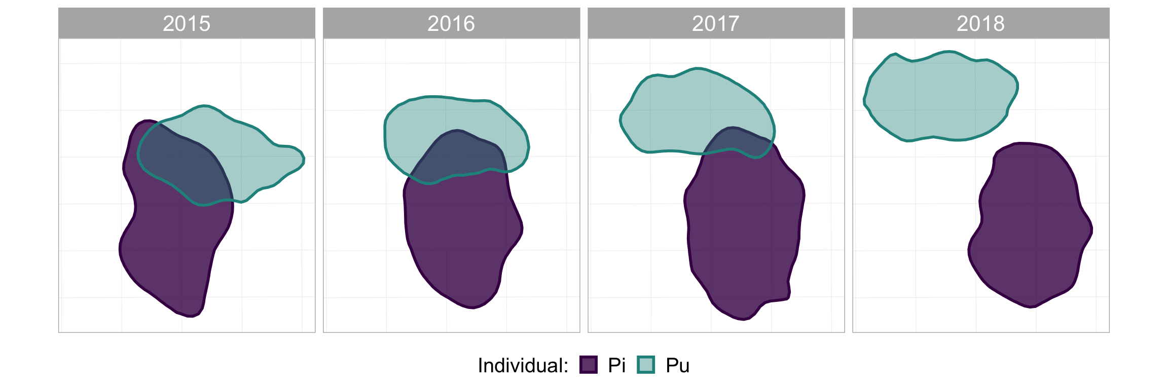
#now add some map-specific things
p_fw_map <- p_fw +
  #scale bar
  annotation_scale(location = "br",  #bottom right
                   height = unit(0.2, "cm"), #how thick it should be
                   width_hint = 0.4, #how long relative to the data
                   text_cex = 0.8) + #size of the text
  #compass arrow
  annotation_north_arrow(location = "tr",  #top right
                         which_north = "grid",  #grid or true, depending on your data projection
                         height = unit(1, "cm"), #how tall the arrow should be
                         width= unit(0.5, "cm"), #how wide the arrow should be
                         #below: style of the arrow
                         style = north_arrow_orienteering(fill = c("black", "black"),
                                                          text_size = 9))
#take a look at it again
p_fw_map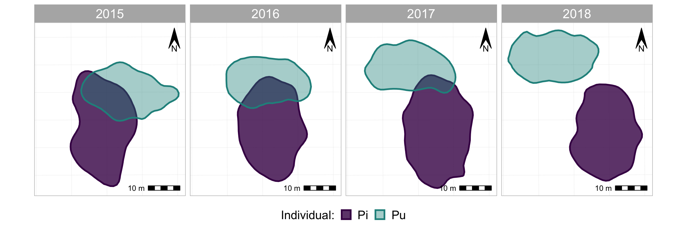
Looks quite nice eh? And maybe that’s enough, maybe that does all you want. But why not animate when you can animate???
First thing we need to do is take out the facet_wrap(~Year) because that is the variable that we’re going to be animating instead.1 Then we’ll add back in the map components…
#the same plotting code as above, except without facet_wrap()
p_nofw <- ggplot(poly_sf_unlist, #the data is the sf object,
               #set aesthetics based on the other columns/vars in the sf df
               aes(color = Ind, fill = Ind, alpha = Ind)) +
        geom_sf(size = 1) + #the geom used to plot sf objects; size refers to the border thickness
        scale_alpha_manual(name = "Individual:", #manually rename the alpha var (for legend title)
                           values = c(0.8, 0.4)) + #manually set the alpha values for each indiv
        scale_color_manual(name = "Individual:", #manually rename the color var (for legend title)
                           values = viridis(3)[1:2]) + #manually set the colours for each individual
        scale_fill_manual(name = "Individual:", #manually rename the fill var (for legend title)
                          values = viridis(3)[1:2]) + #manually set the colours for each individual
        theme(legend.position="bottom", #put the legend at the bottom
              legend.text = element_text(size = 15), #adjust text size of legend elements
              legend.title = element_text(size = 15), #adjust text size of legend title
              legend.key.size = unit(0.5, "cm"), #adjust size of legend colour boxes
              text = element_text(size=20)) #text size in plot titles

#take a look at it
p_nofw 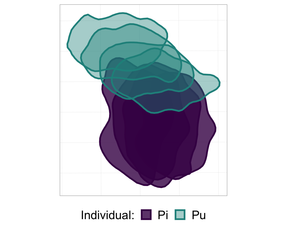
#now add the map-specific things; same code as above
p_nofw_map <- p_nofw +
  #scale bar
  annotation_scale(location = "br",  #bottom right
                   height = unit(0.2, "cm"), #how thick it should be
                   width_hint = 0.4, #how long relative to the data
                   text_cex = 0.8) + #size of the text
  #compass arrow
  annotation_north_arrow(location = "tr",  #top right
                         which_north = "grid",  #grid or true, depending on your data projection
                         height = unit(1, "cm"), #how tall the arrow should be
                         width= unit(0.5, "cm"), #how wide the arrow should be
                         #below: style of the arrow
                         style = north_arrow_orienteering(fill = c("black", "black"),
                                                          text_size = 9))

#take a look at it
p_nofw_map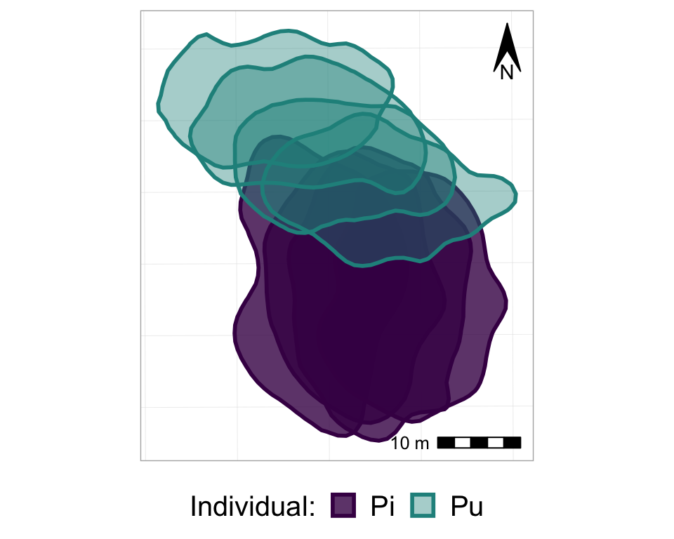
So, now we basically have all of the frames of the animation, all stacked on top of each other. So, finally, it’s time to actually animate it! We will use the transition_states() function from the gganimate package, and just add it to the ggplot as if it is another, regular, ggplot layer. Note that the transition_states() function is used for animating a factor variable - such as, in our case, Year.
#from one phase to the next
anim_p_nofw_map <- p_nofw_map +
  transition_states(Year) #which variable is the different "states" that should be animated

#take a look at it
anim_p_nofw_map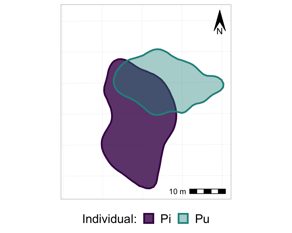
Cool eh? Now, let’s customize it a bit to make it even better…
#from one phase to the next
anim2_p_nofw_map <- p_nofw_map +
  transition_states(Year, #which variable is the different "states" that should be animated
                    wrap = FALSE, #if TRUE (default), the final state will animate back to the first (full circle),
                                  #if FALSE, the animation RESTARTS from the beginning after the final state
                    transition_length = 0.5, #how long, relatively, should to transition between states take
                    state_length = 2) + #how long, relatively, should each state 'freeze' during the animation
  #add a label of the state (in our case, Year)
  labs(title = "Year: {closest_state}")

#take a look at it
anim2_p_nofw_map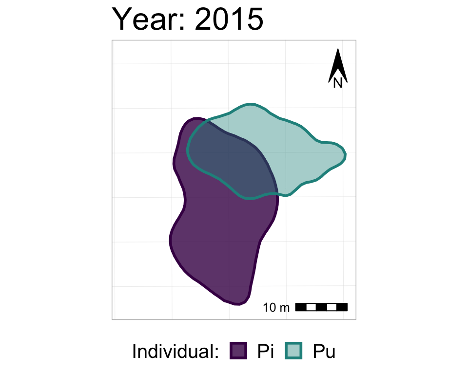
We could also add a shadow_mark() layer, with a low alpha value, in order to have the past ranges stay visible (but very transparent) on the map as the later ranges appear.
#starting with the original, unanimated map,
#I'm re-adding the animation also with shado_mark
anim3_p_nofw_map <- p_nofw_map +
  transition_states(Year,
                    wrap = FALSE,
                    transition_length = 0.5,
                    state_length = 2) +
  labs(title = "Year: {closest_state}") +
  shadow_mark(alpha = 0.2, #very transparent
              size = 0) #no border line

#take a look at it
anim3_p_nofw_map
To specify the height and width of an animation, and to then export it (as a .gif), use the animate() and anim_save() functions.
animate(anim3_p_nofw_map,
        height = 600, width = 600)

anim_save(filename = "Map animation.gif",
          animation = anim3_p_nofw_map) #or use animation = laste_animation() to save the most recent animation
Et voilà! A little gif that you can put on the web, on twitter, or in a slide presentation!
Whenever I’ve made these animations for something, it always takes some time playing around with the sizes of the different mapping elements, text, and the overall height and width of the animation, before things are in proportion, looking good, and well-sized to be shown on a slide or whatever specific medium you plan to use.
Helpful links
These are some resources that helped me learn this stuff, and/or which have further info about the possibilities offered by gganimate, ggspatial, and sf:
- A basic intro to a few of gganimate’s functions offered by Data Novia: gganimate: How to Create Plots with Beautiful Animation in R
- A more extensive introduction to gganimate: Getting started
- A nice intro to the possibilities of ggspatial: Spatial objects using ggspatial and ggplot2, by Dewey Dunnington
- A very extensive introduction to the sf package: 1. Simple Features for R
- The basic ggplot2 page with info about adding sf geoms: Visualise sf objects
- More extensive info about integrating ggplot2 and sf visualization: Drawing beautiful maps programmatically with R, sf and ggplot2 — Part 1: Basics (and be sure to check out parts 2 and 3 on the same website!)
- gganimate on CRAN
- ggspatial on CRAN
- sf on CRAN
Note that it’s important to be familiar with ggplot2 before you start trying to make anything with gganimate.
Footnote
Note that you can include a
facet_wrap()in an animation, as long as it’s a different variable than the one you want to animate. So, let’s say that we had 3 different dyads of individuals over these 4 years, and we wanted to show how - within each dyad - the home ranges are shifting from year to year. Then, we could include, for example,facet_wrap(~Dyad)in addition totransition_states(Year). We would then have 3 separate panels (one per dyad), in which the pair of home ranges changed from year to year.↩