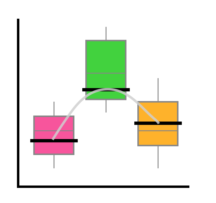
I get a lot of questions about the plots in my conference talks, and I’ve been promissing a post about them, so here’s a first shot. I love plotting, and have recently gotten especially into ggplot2 and some of it’s many options and add-ons. I’ll also include some stats here, to show how to plot the results of of linear mixed model. A hypothetical hypothesis Let’s say that I want to know: How does DJL (day journey length, see the intro of this post if you want more info about what this means) change over the course of a female orangutan’s development?
Continue reading

Changing my data from wide to long format, or vice versa was somehow always a headache. Eventhough I did this a lot, it just DID NOT stick in my head for the longest time. Everytime, I had to google it, and then work through at least 5 failed attempts before I’d get it. Therefore, this totally warrants a blog post, ya? I recently started using tidyr’s spread() and gather() functions to do this, and I find them a lot more intuitive than the alternatives (the tidyverse strikes again), so that’s what I’ll focus on here.

Continue reading

Day Journey Length (or “DJL”), also known as “daily travel distance,” “daily path length,” and other terms, is the cumulative euclidian distance that something (in my case, an orangutan) travels over the course of a day. This is a common measure used in all types of animal ecology and animal behaviour research, as it is a simple measure to characterize movement patterns, quantify an animal’s interaction with its habitat, and it is one indicator of energy expenditure.

Continue reading

Honestly, I am not even sure what to title this post. I can’t remember what I googled that eventually took me to a website that answered my question, but I think it was something a long the lines of “re-level embedded list R” maybe? Anyways… the nifty trick that I eventually came accross that does exactly what I want is probably worth a blog post… Let’s say that I have a list of utilization distribution objects (each calculated using locations collected during a different year) embedded in a list of of different individuals (so, the list structure is Individual > Year > Object).

Continue reading

When I first discovered colour scales, and started to move away from the simple R base graphics col = "red" style of notation, it took me a while to figure out how to actually use a colour scale in R - how to break it up into distinct colours and tell a plotting function which colour to use for what. When I get stuck on something, I often make a note of it, thinking that once I figure it out, it might be worth a blog post… so here we are.

Continue reading

© 2023 Alie. All Rights Reserved
Author's picture

Alie

Evolutionary biologist. Movement ecologist. R enthusiast. (More about me here.)

PhD student

Switzerland/Canada